


Beatrice Warde: “First Lady of Typography”
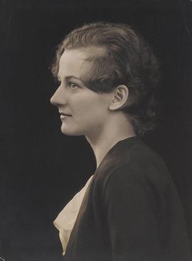
Those of you who read my previous post on Books Across the Sea have already been introduced (very briefly) to American writer and typographer Beatrice Warde (1900-1969).
Like many writers, I have opinions about type fonts,* and I was fascinated to learn about the changing world of typography in the first half of the twentieth century and a woman who made a name for herself in what I am sure you will not be surprised to learned was then a male-dominated field.
Warde began researching typefaces and printing history as an assistant librarian for the American Type Founders company, where she worked from 1921 to 1925, when she married a typographer and moved to London. She entered the professional world of typography under a male pseudonym in 1926, with an article titled “The Garamond Types, Sixteenth and Seventeenth Century Sources Considered”** written under the name Paul Beaujon. The article appeared in The Fleuron, a magazine devoted to typography, and earned “Paul Beaujon” a reputation as a scholar of typography. It also earned “him” a job offer as the editor of The Monotype Recorder, published by the Lanston Monotype Corporation.
Monotype did not revoke the offer after Warde revealed that she was a woman–which could well have happened. She worked for Monotype first as editor of the magazine and later as the publicity manager until her retirement in 1960, making her one of the few women working in typography at the time. In her years at Monotype, she championed both the intelligent revival of historic typefaces and the work of contemporary typeface designers. In the process, she helped shape the face of modern printing. She believed that type should not call attention to itself : “Type well used is invisible as type.” But that didn’t mean that typographic decisions weren’t important: “Type, the voice of the printed page, can be legible and dull, or legible and fascinating, according to its design and treatment.”
One of her longest lasting contributions to the world of printing was a broadside, printed in 1932 to showcase one of Monotype’s new fonts:
This is a
Printing Office
Crossroads of Civilization
Refuge of all the arts
against the ravages of time
Armoury of fearless truth
against whispering rumour
Incessant trumpet of trade
From this place words may fly abroad
Not to perish on waves of sound
Not to vary with the writer’s hand
But fixed in time having been verified in proof
Friend, you stand on sacred ground
This is a Printing Office
Her words were cast in bronze and stand at the entrance to the United States Government Printing Office, a tangible reminder of the power of the printed word.
*So many ways to be a nerd.
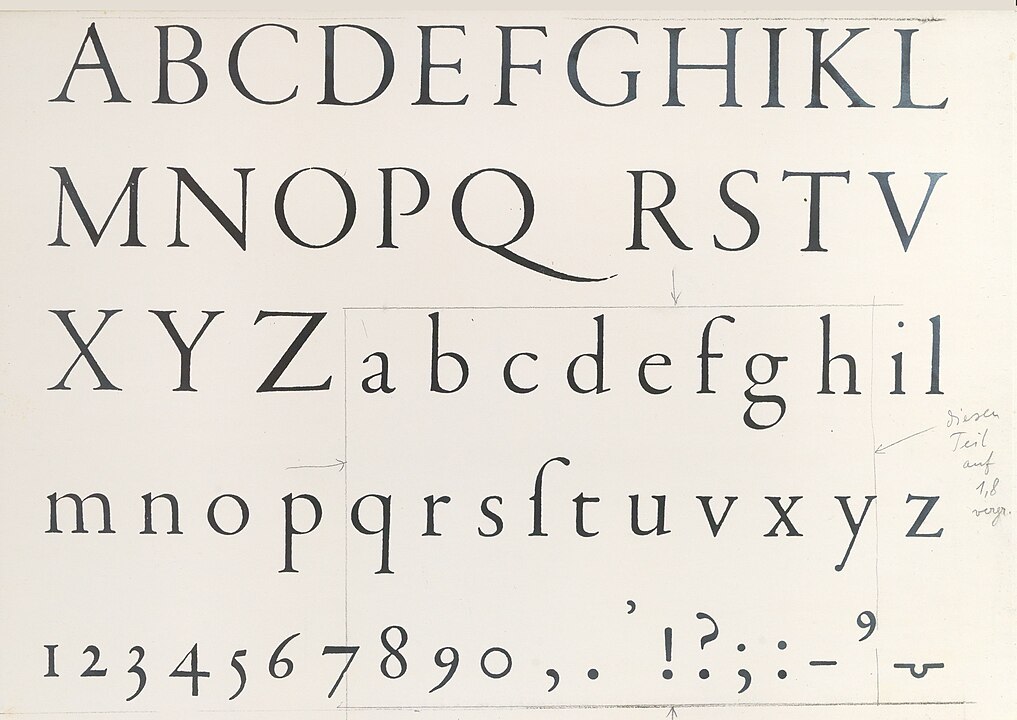
**For those of you who are not font nerds, Garamond is a group of serif-style typefaces based on the work of a sixteenth-century Parisian engraver named Claude Garamond.
*** This blog post led me down a lot of rabbit holes that I ultimately cut, but I couldn’t resist sharing this one: A fleuron, literal a leaf, is a typographic element used to divide paragraphs, differentiate items on a list, or as ornament. (A much nicer term than a bullet list. Also known as a printers’ flower, or “horticultural dingbats.” If I can figure out how to do it, horticultural dingbats may replace asterisks on occasion in this blog.****
****So far, I have failed in this attempt.
Delightful read and so informative. I love “Paul’s” daring, and the results she achieved. I’m looking forward to seeing some horticultural dingbats in future posts.